The hUmagazine Documentation
hUmagazine is an online periodical inspired by topics dear to gender studies. The choices that have been made both in the back-end and in the front-end aim to reflect its philosophy and intentions.
The resource collects issues organized in thematic magazines and enriched with meaningful metadata for active use of the contents.
The portal can be viewed according to 4 typographic styles (5 considering the initial neutral style), each referring to a different period as described on the home page.
Each issue of the magazine shows the articles side by side on the same web page and allows for a comparative analysis of the available metadata.
LLLL The Framework
Our LLLL framework allows the management of any number of magazine issues, each containing 3 articles displayed simultaneously in 3 columns side by side.
Specific markups within articles enable the use of Metadata Selectors, while a basic textual analysis is always automatically processed regardless of the inserted tags.
Every page includes two common elements - the header and the footer - loaded from the respective HTML files stored in the /components folder.
Each issue of the magazine provides:
- a cover page containing the name of the editor, release date, and a summary of contents with complete details about the source of the articles, as well as some identifying keywords;
- the actual magazine, always made up of 3 articles displayed side by side and their respective metadata selectors.
At any time, the reader can change the typography style using the hand icons. The selected style will be maintained when switching to another page, thanks to a session cookie that stores the active theme status.
The framework runs on Bootstrap 4.3.1 and 5.1.3, and jQuery 3.5.1.
Content Management
The contents of magazines are stored inside the following elements, that must always be present in the hosting space of the website:
- The file
issuesDb.jsonin the root directory: it contains a main object having the key "issues", whose value is an array of objects, each with the details of the single issues of the magazine (number, publisher, release date, details on the source of the three articles and 3 keywords each) - The files of the individual articles, stored in the
/articlesfolder, whose names must have this standard syntax:
article[n_magazine]_[n_article].html(e.g. "article1_3.html" for the third article of the first issue). - Images and other multimedia contents can be stored in the
/imgfolder and organized into separate subfolders for each article. However, they can also be stored elsewhere or loaded from external URLs. - The glossaryDb.json file in the root directory can contain any number of terms with corresponding definitions in JSON format. Each time the home page is loaded, the system randomly chooses a word and displays its definition in the right column.
Very important for the correct display of the articles' previews on the home page are the ids assigned to the title, the subtitle, the author and the main image inside the article. The expected ids are respectively title[n_magazine]_[n_article], subtitle[n_magazine]_[n_article], byline[n_magazine]_[n_article], and img[n_magazine]_[n_article]
The system also reads the issuesDb.json file to determine how many magazine issues have been defined, then dynamically arranges the corresponding items in the main menu, along with the covers and the contents while browsing.
Markup
The articles were tagged with significant metadata using classes and data-* attributes, that give us the ability to embed custom data inside HTML elements, access them via the dataset property (or the .data() method in jQuery), and avoid Ajax calls or server-side database queries.
Each metadata tag - mainly <span> tags - must specify mention and one or more of the following metadata types as classes: person, language, place, date, organization, keyword.
Each element needs also the following attributes (required for the selector to work properly):
data-label: It's the label that will be shown in the Metadata Selector;data-sort: It's the string that will be used for sorting (e.g. for persons, with the last name before the first name);about: Is the normalized topic indicator (e.g. both "social group" and "community" could be tagged with theabout="society"attribute)
We also put the expected ids inside the main elements of the articles as described in the previous paragraph, to display previews in the left column of the home page.
Metadata Selection
Each article has a related Metadata Selector on top. It organizes into distinct tabs the metadata categories as identified inside the content. Each tab lists the words marked in the article body with that category, ordered by the content of the data-sort attribute. In case the data-sort attribute is missing or empty, the platform will use the data-label value for sorting.
By selecting a checkbox, the articles scroll to the first occurrence of the selected data, while every occurrence is highlighted with a random background color. The label of the selected checkbox gets highlighted with the same color. By clearing the checkbox, the text backgrounds become transparent again.
Regardless of the metadata categories used, at the bottom of each Metadata Selector there's a tab called "Analysis" that's the subject of the next section.
Text Analysis
When each article is loaded into the framework, a statistical analysis of the text is performed which returns the following information:
- Total words, average word length and number of sentences identified;
- Sentiment: The global sentiment score, that is the arithmetic mean of the sentiment score of each sentence. Single words are given a sentiment score from -5 to +5.
- Sentiment amplitude: The arithmetic mean of the differences between the lowest and the highest sentiment value for each sentence (single word scores range from -5 to +5);
- Politeness: The arithmetic mean of the politeness of each sentence, evaluated on many different features of natural language;
- Dirtiness: The arithmetic mean of the dirtiness of each sentencs, evaluated on many different features of natural language.
- The list of the first 10 most frequently used words in descending order, net of the most common stopwords.
The synthetic sentiment, politeness and dirtiness scores are calculated using a third party JavaScript component named Compendium JS. The procedure for calculating words frequency and displaying the first ten positions in descending order was entirely written from scratch. We used the standard stopwords list from the NLTK Library.
Wikipedia Previews
Properly tagged parts of text show a preview of the corresponding Wikipedia page when hovering. Names with this feature enabled have the W of the Wikipedia logo at the right end, partially overlaid on the text as a watermark.
This function was realized through the JavaScript component Wikipedia Preview. Active elements must have the data-wikipedia-preview boolean attribute and the wmf-wp-with-preview class.
Internal Search Engine
Our framework has an internal JavaScript search engine based on lunr.
Being it part of the header, the search field is available on every page of the website. After inserting the words to be found, it looks for them inside the articles (it doesn't look inside static pages), then it returns the list and a short preview of the articles where the words have been found. Results are sorted by relevance. Clicking on a result, it opens the issue containing that article.
Message Form
At the bottom right of the footer, there is a contact form to send ideas, proposals, considerations of any kind about hUmagazine. By submitting the form, an email is sent to the webmasters with both the sender's email address and the message in the body.
This function is based on the SmtpJS.com component. Sending takes place via the smtp.gmail.com server using an ad hoc account.
hUmagazine
hUmagazine consists of three fundamental concepts: human + you + magazine. The reader, the "you" on the other side of the screen, is called on to ponder and investigate the issues that may interest the user firstly as a human being, beyond any label or gender category.
As previously explained, the resource stays faithful to its contents also on a graphic level. The four styles, chosen for the different visualizations of the magazine, stop precise historical moments in the evolution of this kind of topics.
The first style harks back to the Renaissance prints and taste, especially looking at Aldo Manuzio’s productions. Marking the real beginning of the publishing industry, the 16th century was a period of great innovations albeit characterized by immense gender disparities.
The second one reproduces the unique style of the 1950s, with their bold colors and captivating images. In fact, thanks to the postwar economic boom, the publishing industry lived a true dream decade. However, despite its patinated look, most of the iconic 50s magazines and advertisements massively contributed to the stigmatization of gender stereotypes whenever it might be helpful in targeting different demographics.
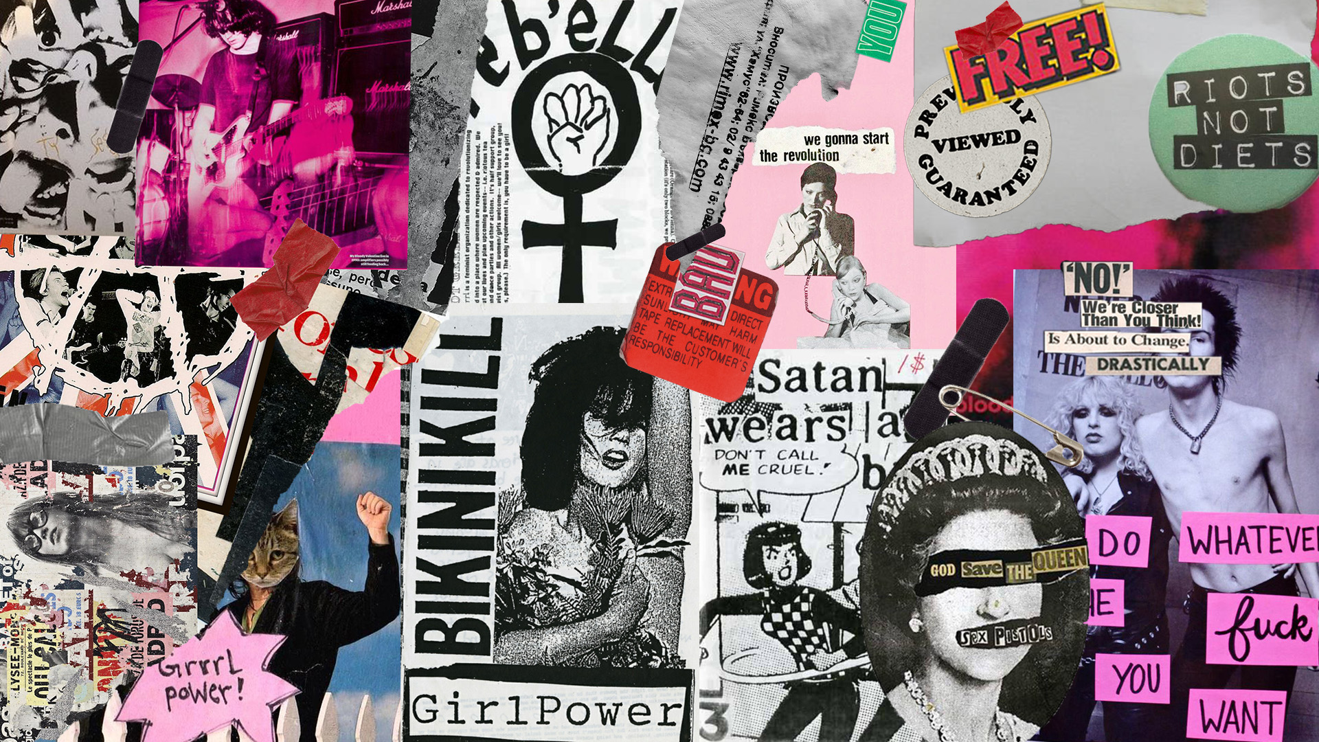
The third style is mainly inspired by the 90s, when a true revolution happened both in the history of gender studies and of publishing. The overall style of this theme evokes the independent, underground publications of those times, the Zines, and Riot Grrrl movement.
The last one tries to look to a near future, inspired by the most recent graphic trends, hoping to see the same visual harmony in the way gender topics will be treated.
Theme 0: the default style
Our default theme is not based on any specific historical trend but simply mirrors the aesthetic of some renowned magazines such as the Atlantic and the New York Times. It's characterised by fine lines and pretty standard colors: white, darkgrey, #212529, and #007bff. No animations, nor graphic elements were included in order to keep it minimal and clean.
For the font we opted for Lora, designed by Cyreal. It is a well-balanced contemporary serif with roots in calligraphy. Its overall typographic voice recalls that of a printed periodical which convinced us even more on this choice.
- The Atlantic
- The New York Times
- The Wall Street Journal
- Ornament prints by Jean Démosthène Dugourc
- Plinio Secondo, Gaio (23-79). Prima pars -Secunda Plyniani Indicis editi per Io[h]ane[m] Camerte[m] - Naturae historiarum libri XXXVII. Parigi: ex officina Petri Gaudoul Bibliopolae, 1524
- Heavenly Craft: The Woodcut in Early Printed Books
- L'editoria veneziana fra '500 e '600
- Design Flashback: 10 Iconic Typefaces Born In The 1950’s
- Magazines During 50’s
- The Ideal Woman
- Masculinity, Gender Roles, and T.V. Shows from the 1950s
- Exploring Gender Roles In Vintage Advertising
- How to Make a Zine: Fonts, Graphics & Templates to Get You Started
- "But I Love The Zine" Documentary
- Riot Grrrl and Beyond: The Power of Feminist Youth-Based Creativity
- Riot Grrrl
- A Brief Visual History of Riot Grrrl Zines
- Zine Activism: No-Filter Feminism
- Transparency (frosted-glass effect using a Background Blur),
- Vivid colors to highlight the blurred transparency,
- A subtle, light border on the translucent objects.
Theme 1: the XVI century and Aldo Manuzio's print house
Historical background
In the first half of the XVIth century, Venice became the beating heart of world publishing. As a matter of fact, it is estimated that about half of the books published throughout Europe were printed in the Serenissima. Despite being a German invention, printing had had fertile ground between the Venetian rue and large print shops owned by great innovators, such as Aldus Manutius. Following his lead, we took inspiration for color and layout choices, from the justified and inverted cone text to the headings' style, from the ornamental elegance's of his works to the fonts.
Layout and colors
Evoking his aesthetic, we decorated topbar, footer, the issues' cover, and the articles' section with re-elaboration of some neoclassical ornamental prints. Our choice fell on the arabesques series by Jean Démosthène Dugourc owned by the British Musuem, which we believe perfectly embodies the renaissance’s taste we were trying to reproduce.
To stay historically consistent, we keep it minimal when it came to colors, opting for a clean #f6f1e8 background and black text. The color #B63323 highlights relevant elements (such as headings and links): red inks were in fact commonly used since the Medioeval to draw the attention of the readers eye. This technique became known as rubrication, from the latin verb rubrico, "to color red".
For the same historical motivation, we decided to follow the golden rule ratio to set our font-size and line-height. We chose 16px as our base and used 1.618 as ratio. Then, we added and applied, in some cases, a secondary and smaller ratio aspect (1.25) for visibility reasons.
Fonts
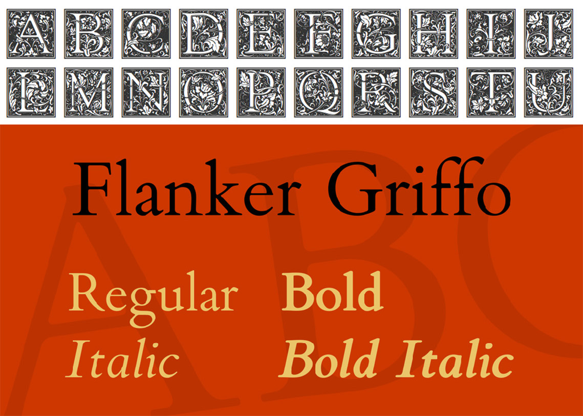
Goudy Initialen is the font we identified as the most accurate to reproduce the iconic decorated drop caps of the XVI century's prints. These floriated initials were firstly designed in the early 1900’s by Frederic W. Goudy and then used by Dieter Steffmann to create this font.
For the rest of the body, our choice fell on the Flanker Griffo, a multistyle family designed by the italian Studio di Lena. This font reflects the style of typefaces (like Bembo) designed by Francesco da Bologna, also known as il Griffo, for the Venetian printer Aldo Manuzio between the late XV and early XVI century, but unlike the others it returns a coarser and more realistic look to the text. The letters appear in high contrast, with serif, connections between the arms and ball terminals of the lower cases.
Source and inspirations
Theme 2: the 50s, their iconic ads, and gender stereotypes
Historical background
Most everyone is familiar with the storybook image of America in the 1950s, images of a simpler, happier time emerging from the aftermath of the Second World War. Families moved to the suburbs, fostered a baby boom, and forged a happy life of family togetherness in which everyone had a specified role.
Studies of postwar culture found that government propaganda, popular magazines, and films reinforced traditional concepts of femininity and instructed women to subordinate their interests to those of returning male veterans. Either for economic reasons (to target the right audience) or for the political ones (the nuclear family against the fear of a new upcoming world conflict), the gender stereotypes fixed during those times had heavy and long-lasting consequences.
Layout and colors
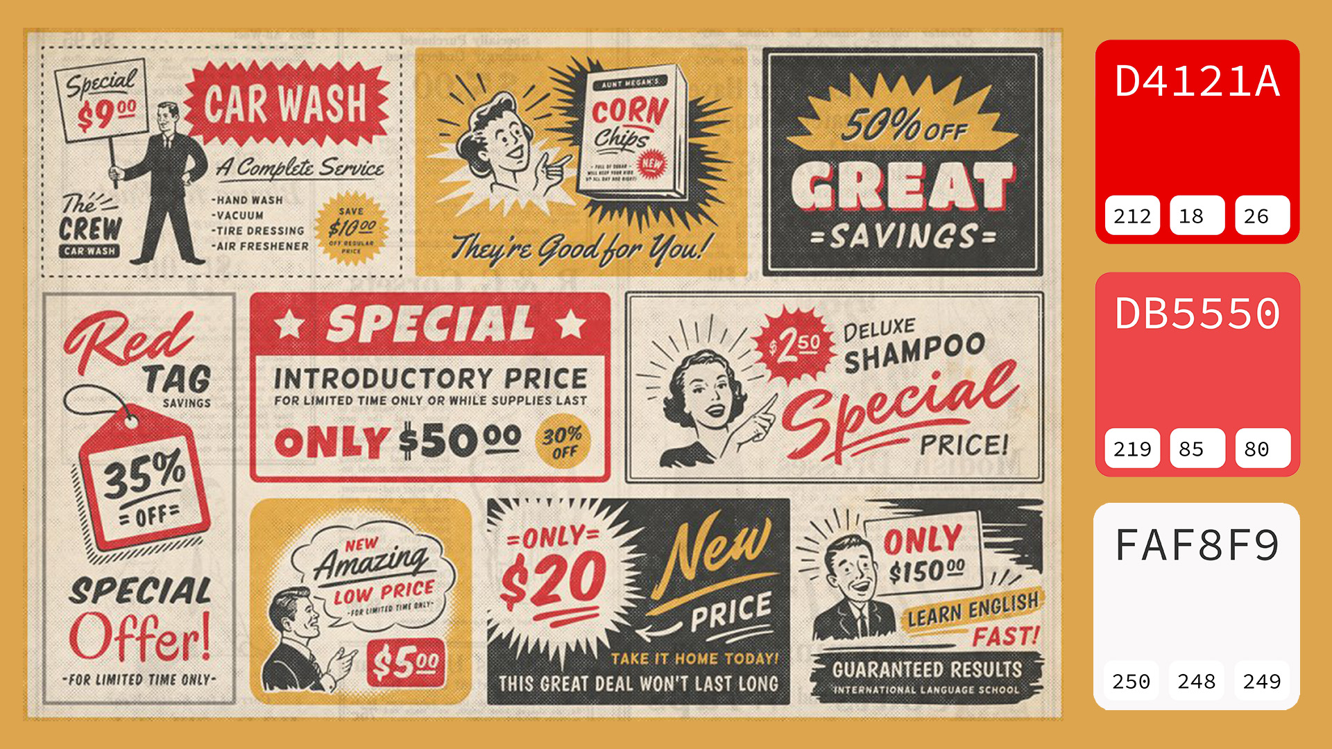
Magazines were a staple of communication and culture in the 1950s. Because TV was relatively new, print media was the main way that most people kept track of trends and world events. Messages needed to be spread in a vivid and effective way and in order to get this result the publishing industry exploited bold and catching fonts and a creative use of colors.
Theme 2 features banner ads, vintage pngs reovoking the gender conflict
, and captivating colors.
Fonts
For the headings we opted for the Rocket Script, designed by Font Diner, a major resource for retro design software products. This font perfectly embodies the vintage vibe of the 50s ads, especially the ones from the automotive industry.
The second font we used for the body is Optima, being one of the most iconic fonts to come out during that decade. It is a humanist, sans-serif typeface designed by Hermann Zapf between 1952 and 1955 for the D. Stempel AG foundry, Frankfurt, Germany.
Sources and inspirations
Theme 3: the 90s and the Zine-activism
Historical background
The overall style of the third theme aimes to look like a zine, which is most commonly a small circulation publication of original or appropriated texts and images. More broadly, the term encompasses any self-published unique work of minority interest, usually reproduced via photocopier.
Zines have been around since the 1930s among fans of science fiction and also have roots in the independent, underground publications that focused on social and political activism in the ’60s. By the ’70s, zines were popular on the punk rock circuit. In the ’90s, the feminist punk scene propelled the medium and included such artists as Kathleen Hanna, who produced Riot Grrrl out of Olympia, Washington.
Riot Grrrl began as a DIY, feminist punk movement in the early 1990s in the Pacific Northwest. It encouraged young women to express themselves in non-hierarchical ways: to accept themselves and each other regardless of difference, to form their own bands, self-publish their stories and strategies in zines, and to create safe spaces for this expression in the face of misogyny. The movement saw girls as a "revolutionary soul force" with the power to disrupt the status quo; rejecting social constructs of how women were supposed to look and behave; and zeroing in on personal and political discussions of sexism, sexuality, sexual violence, female empowerment, racism, ageism, homophobia, fat shaming, and able-bodiedism.
Layout and colors
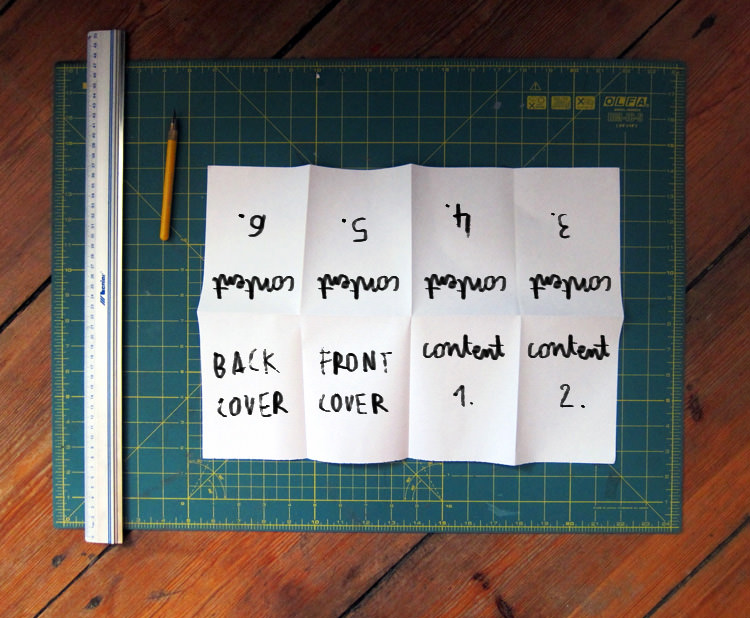
Riot Grrrl’s zines were our main inspiration when it came to colors and graphic elements. Most of the pngs around the website were directly taken from their prints, like, for the example, the iconic Bikinikill's cover. Other graphic elements were created from scratch to give back the DIY's aesthetic. Moreover, we applied a bright filter on the images lending them the funky look of zines illustrations.
Also, every page shares the same background which reproduces the iconic folded layout of any common zine.

Fonts
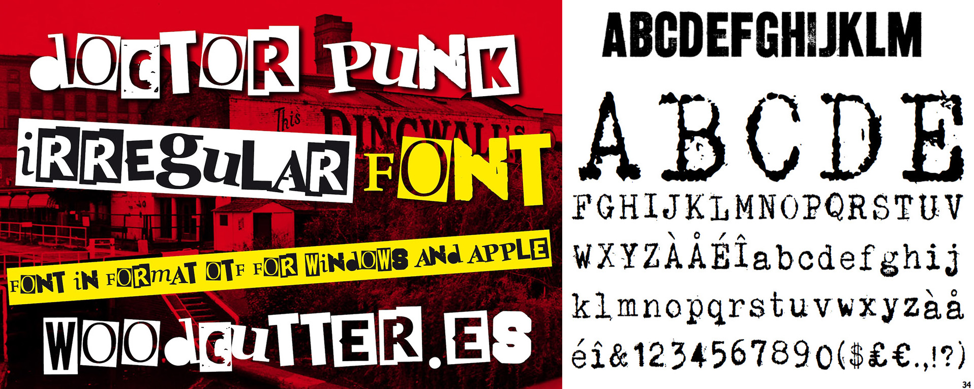
The zine aesthetic is also related to specific kinds of typefaces and lettering, so our choice fell on three unique fonts we used to replicate that textured, scrappy vibe.
For the headings we alternated Doctor Punk, designed by Woodcutter, and ZineTime by Remedy667, a gritty sans serif display face derived from old newspaper headlines that have been photocopied and photocopied.
The third one, used in the rest of the text, is Simple Things by Ian Barnard. Each letter has its own personality and inconsistency of ink coverage which make them look very realistic.
Sources and inspirations
Theme 4: towards a future harmony
Historical background
Lastly, we wanted to translate our predictions and hopes for a near future of gender studies’ topics to the visual level of our fourth theme. We were looking for a graphic style that could embody concepts, dear to our vision and gender issues, such as fluidity, harmony, and transparency. After analysing the current trends, we decided to take inspiration from the new Glassmorphism wave, combining it with elements of its rightful predecessor, the Neumorphism.
Layout and colors
Glassmorphism is a term used to describe UI design that emphasises light or dark objects, placed on top of colourful backgrounds. A background-blur is placed on the objects which allows the background to shine through – giving it the impression of frosted glass.
While Neumorphism was imitating an extruded, plastic surface (but still looking like one layer), this new trend goes a bit more vertical. Its most defining characteristics are:
That verticality and the fact you can see through it, means users can establish hierarchy and depth of the interface. They simply see which layer is on top of which, just like pieces of virtual glass.
In fact, the glass effect is prominant throughout our website, especially in the issues' section where we exploited this graphic choice to enhance readability and focus.
Fonts
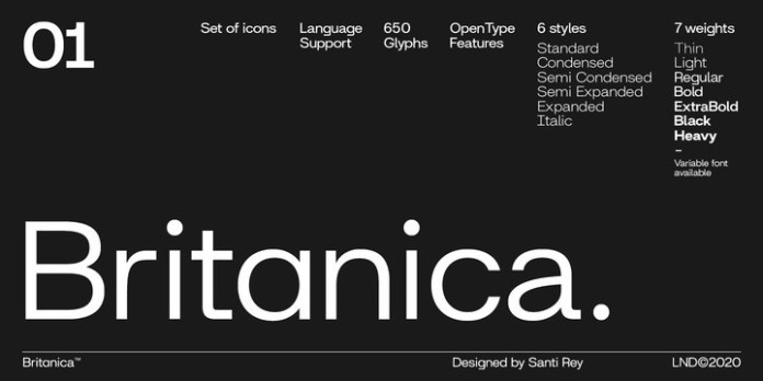
For the last theme we took a look around and chose among the currently most trendy fonts. Santi Rey is nowadays a very renowned font designer and his Britanica suits perfectly our futuristic style. It is an extremely versatile family inspired by the neo-grotesque typefaces of the 20th century. Its morphology has a modern and geometrical feel and is based on simple and recognizable shapes, making it highly legible.
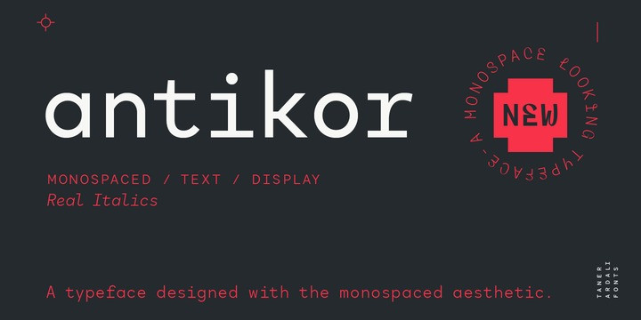
The second font is Antikor by Taner Ardali, a proportionally spaced monospaced typeface.
